The beauty of launching a full sleeve when the entire design is already plotted out is that it is a truly special thing.
Perfect and thoughtfully planned. Engaged in discussions with clarity. All the appointments are secured as per the conditions stated. Blueprinted meticulously. Formally dedicated.
To be honest, that was the setup here. A samurai warrior full sleeve with all seven sittings locked in from scratch. For the tattoo artist, that is pure gold. That means the project moves on continuously, the energy is always on top, and the design gets to be treated as one whole piece rather than a number of stray appointments scattered all over the calendar.
Measures on the forearm were the main focus in the first two sessions. This served as the basis for everything that was to come, and the forearm had to bear many burdens. It was like a strong spine and trusted the right properties; the upper arm dragon and the sleeve as a whole had to rely on it to grow seamlessly.
At the beginning, the idea for the sub part was to have a geisha. However, before the appointment, the concept changed. This hasty decision turned out to be the best one of the entire project.
Table of Contents
- Why the design changed from geisha to female samurai
- Building a sleeve that flows instead of fighting itself
- The colour palette that ties the whole project together
- Why pre-booking all seven sessions changes everything
- The design reveal and why client trust matters
- Stencil placement is where the sleeve either starts to sing or starts to struggle
- Day one focused on the portrait foundation
- What makes an ideal large scale tattoo client
- Day two was about pushing the piece further and making it read better
- Why cherry blossoms work so well in Japanese inspired sleeves
- The forearm as the visual anchor of the sleeve
- Technique matters, but planning matters just as much
- What this first section sets up for the rest of the arm
- The finished result after two consecutive days
- Lessons worth taking from this project
- FAQ
- Final thought
Why the design changed from geisha to female samurai
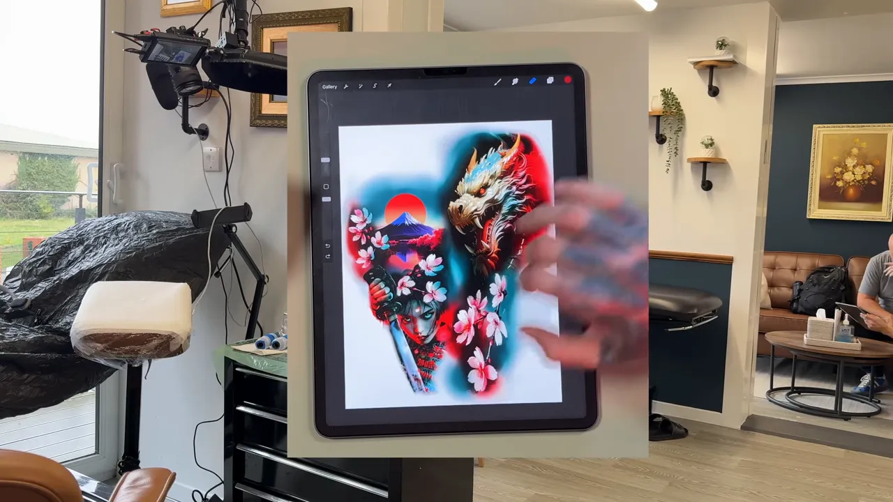
The basic idea is definitely great. A geisha on the forearm, dragon above, cherry blossoms flowing through, all wrapped into a Japanese inspired sleeve.
However, it can be the case that a plan that sounds viable in theory still appears a little misplaced in your gut feeling. Such was the case here. Just a few days prior to the meeting, the client reached out to us since he had doubts about the geisha concept.
This statement is not always indicative of poor performance. At times, it signifies that instead of a complete overhaul, the idea just needs some fine-tuning.
The wiser way was to not remove the portrait but rather to retain the feminine focal point and just switch the character. The softer, very much stylistic geisha was transformed into the bolder, and more aggressive female samurai portrait. Sleeve, same character. Different energy.
The pivotal change can be seen as the fact that tattoos are not solely reliant on the aesthetics of an image but also emphasize the importance of the right attitude. Indeed, wearing a sleeve tattoo with a dragon, blossoms, and motion, which is printed with a black and white scheme is a good idea if the portrait stands up to all of this. A female samurai does the trick. She represents strength, poise, and a sense of danger. Thus, the entire forearm is more impactful.
The dragon bridge, which was meant for the upper part of the arm, was additionally created by developing it as a better bridge. The layout seems that the designer squeezed in two distinct themes; however, with the design that is used the sleeve looks more cohesive in an instant.
Building a sleeve that flows instead of fighting itself
A strong sleeve really demonstrates the principle of flow, which is one of the notable differences between a good tattoo and a strong sleeve.
A sleeve must be more than just a cool print stuck to the arm; it needs to be wrapped. It must be a directional element of the viewer's vision. It should be a part of the body but not an element that appears on the body.
In this forearm area, the portrait has been the hero all the time. The face had to be in the place of the utmost visual importance. Everything else had to support that.
A sword eye was distracted from a face and led to the forearm with the help of the sword. Water forms were subjected to an initial upward motion. The flowers were brought in along the way to add rhythm and layering. Thus, the design was animated by those elements, being able to move it, instead of just sitting there.
The technique is most often used on hand-payed fabric that is non-stretch, although it can also be made with a stretchable fabric, but the amount of elastic you can get into it will be less than with non-stretch fabrics. Not filling space at random, but making every part of it lead into the next one is the way to start a sleeve successfully.
Moreover, there was a practical reason behind it. A small cover which would be done on the arm higher up would normally be tackled later in the project, hence the lower forearm had to set enough authoritative visuals to the fact that the upper work would be attached to it- it would be forced to look that way.
A good design of a sleeve usually involves asking a few straightforward questions.
- Where does the eye land first?
- What carries the eye around the arm?
- Which shapes create movement?
- How will the next session attach to this one?
- Which part needs the most contrast and detail?
Knowing the answers to those questions in advance practically gives you a headstart when compared to those who will have to deal with this only after the machine starts.
The colour palette that ties the whole project together
A Japanese inspired sleeve can be made or broken depending on the use of color.
In respect of this project, the palette was specifically very limited. The objective was not to use every color available in the spectrum of colors on the arm. Its main aim was to maintain a uniform appearance throughout the entire period from the first session to the seventh session.
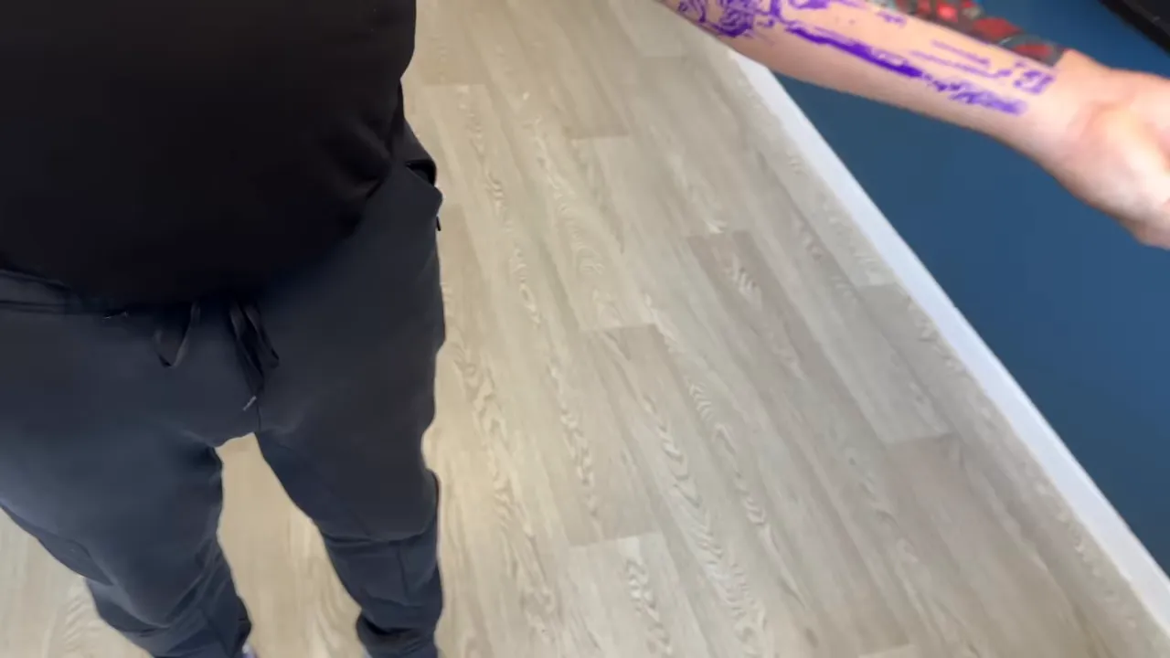
The pre-dominant color was turquoise blue and its accent hue was very bright red. The two hues work together in several ways.
- It feels bold and dramatic.
- It nods to classic Japanese tattoo colour language without copying it outright.
- It gives strong temperature contrast.
- It allows skin breaks and darker tones to work harder.
Japan's formative tattoo art is often characterized by the audacity of red hues, and there lies a very solid rationale. Red is heavy. It protrudes. It causes an impression. Moreover, the use of yellowish cool-green makes the whole design look more three-dimensional with contrasting tension.
In this instance, the female samurai painting turned out to be the ideal venue for the palette. The cheeks, hair, blossoms, and sword can all act different roles in the same color family while keeping the appearance unclouded or not unconnected.
The importance of a full sleeve consistency is one of the most underestimated aspects ever. The design can happen to look perfectly fine independently and create issues later on if the color scheme is too free. Careful color allocation at the very beginning can definitely save from a lot of struggles in the future.
Why pre-booking all seven sessions changes everything
To be candid, I think this is one of the least appreciated sections of a successful sleeve project.
When it comes to the reservation of all the periods in advance is done, then the entire piece is more likely to get better odds of turning out exactly as it is. The artist can think in the long run. The client is aware that the dedication is for real. The appointments can be spaced out and arranged accordingly. The energy is kept ongoing.
The project goes on without having to restart the mental engine every few months.
This is important not only for the convenience of scheduling but it also has implications on:
- Creative continuity because the vision stays fresh
- Skin planning because healing windows can be respected
- Budget clarity because the client knows the scale of the commitment
- Psychological momentum because both sides are already invested in the full outcome
The distinction between constructing a sleeve tattoo and performing seven independent tattoos that are located on an arm is massive.
This project was very much the first option.
The design reveal and why client trust matters
Trust is something that has given this work the quality of interest and respect.
The client was focused on a particular concept. His desire was for a dragon, flowers, and a Japanese touch. In addition to that, it was up to the artist to envisage. This type of freedom is highly priceless when your goal is to craft a tattoo that is functional and has artistic merit instead of merely fulfilling an unconnected list of requests.
And the moment the new design was brought to light, the response spoke volumes. The shift from geisha to samurai was just perfect without a doubt.
It is a perfect situation. The client gets the feeling of being listened to, while the design development is brought in by a totally professional viewpoint.
Trust isn't about handing over all control to the artist. Instead, it entails working together with sufficient confidence so that the most excellent concept could succeed.
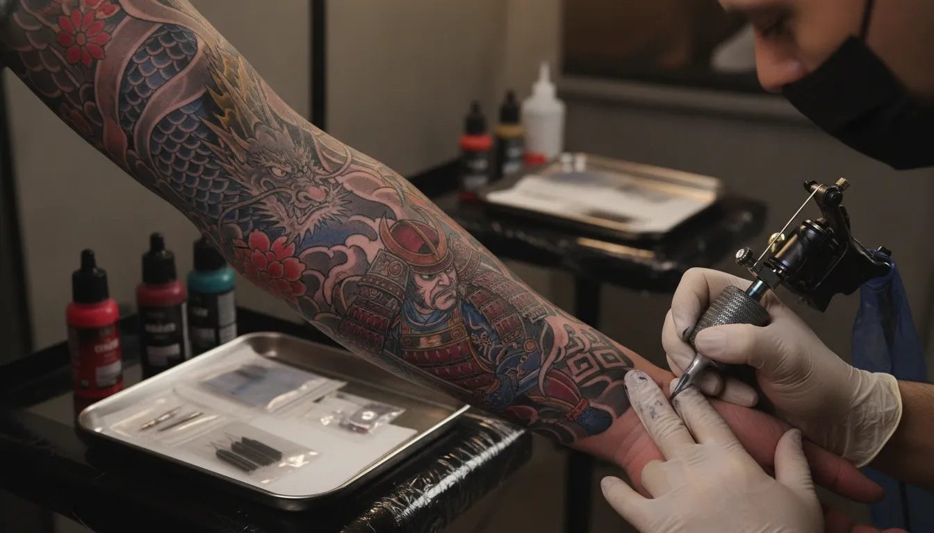
Stencil placement is where the sleeve either starts to sing or starts to struggle
The next key step after the design approval is the placement of the stencil.
This isn't a matter of formality. It's not just about putting a paper on the skin and then continuing on your way. Placement is the process during which a flat design is ascribed to a curved and moving surface. If this component is adjacent, the tattoo will be in opposition to its own body structure during the entire period of its existence.
The face on this forearm had to be placed correctly in the frame. The sword had to draw the eye in the right direction. The water and blossoms had to begin to wrap naturally. The placement of the visible hand was also important because it helped to illustrate the composition and the story.
The clarity of the whole picture is attained when the stencil is properly placed. The focal point peeking through is viewed. It is also the same where the arm will pivot into different angles. The space that disappears and the other elements will be shown which will be used is breathing.
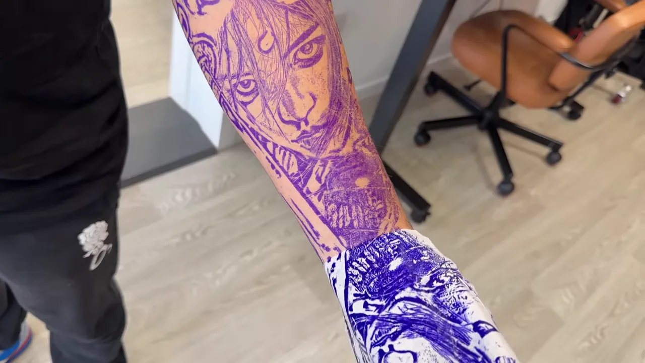
The fact that it is often the case that designs of sleeve fail to fully communicate their stories that's the reason one has got to know. These wearings are indeed designed to be different, to walk around your arm. No, it is not only turning your arm to see the other side that you can do. A mirror check, a turn of the wrist, and a slight bend of the elbow can reveal much more than a flat image ever will.
Day one focused on the portrait foundation
The first day was clearly defined. The objective was to get the lower forearm in place. Secure the portrait. Fix the color direction. Construct a sufficient portion of the movement so that the second day can just carry on pushing the section further instead of wasting time reorienting itself.
In terms of productivity, it was a day that any tattoo artist would cherish.
The layout was powerful. The epidermis was fine. The customer was motionless. There was no regular moving, no theater, no dissent. Only the headphones on, both individuals in their respective zones, and several hours of good work.
Having a session like that is uncommon, hence you learn to treasure it every time it comes by. Getting a tattoo done skillfully doesn't only depend on how good you are. It also relies on whether the environment is suitable enough for you to perform the task correctly.
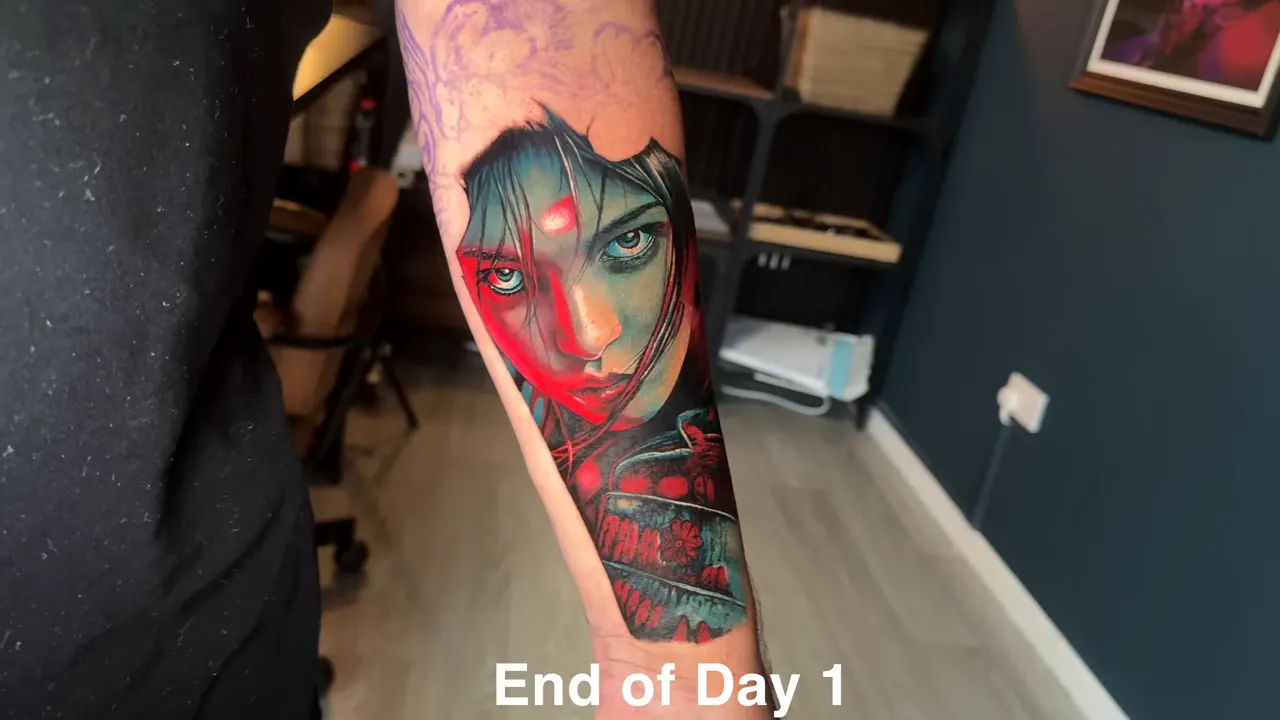
At the end of the first day, the artwork of the female samurai was already creating an impactful visual impression. The female samurai was exuding a rigidly determined styling that the sleeve had required. The red and blue palette was demonstratively bright. The pointed blade was the one that directed the forearm. Although it was not completed, the portion still looked like it was designed that way.
It was not just an arbitrary first pass; it seemed to be the first step in a grander scheme.
What makes an ideal large scale tattoo client
Artists may have their own way of looking at the dream setup, but this venture could meet almost all of the requirements.
Clients who are perfect for large scale work are often characterized by five traits:
- They choose a project with real visual potential.
- They trust the design process.
- They sit well for long sessions.
- They book the whole project properly.
- They heal well and follow aftercare.
This one had four of the five locked, and the fifth temperament was only time healing, which there is nothing else to confirm.
It may appear to be simple, but in actuality, it has a huge impact. Big tattoos are teamwork and resilience ventures. A chaotic tattoo client who is cantankerous, goes absent for months at a time during the tattooing process, does not listen to the aftercare instructions, and modifies the design in the middle of the tattooing process can cause even a great design to fade.
If a person turns up with full dedication and calmness, the project gets the required space to operate.
Day two was about pushing the piece further and making it read better
Day two began exactly like a typical day two would. There was a slight soreness, a tightness, and a feeling of unfinished work is still acclimatizing.
It sounds perfectly normal. The fundamental thing is that the design should still remain bold and tell the right story after the bandage is taken off and the arm comes back to its normal condition.
As if on cue, the tattoo looked stunning in real life. This is rather comforting since, almost always, body tattoos turning to an image of a person look much better in the real setting than they do in isolater photos.
The second day of the program was not so much about creating anything new as it was about building on the existing. Continuity is critical. The design and schedule were fixed, and thus there was no ambiguity. It was simply a retrace of the back to the work.
Getting a proper finished section from a promising base is just a few steps away, as the forearm section has already received a lot of the refinement, the addition of more color, more layering and more of the visual information.
Cherry blossoms have now assumed a greater role. The image has become more impactful. The lower composition has become clearer and more intentional.
Why cherry blossoms work so well in Japanese inspired sleeves
Illustrating a profound philosophy of life, cherry trees have little else to offer in spring than decorative flowers.
They soften angular lines. They scatter large volumes. They provide a feeling of movement. They render transitions to be graceful rather than direct.
In a design focused on a strong woman samurai and a futuristic dragon, the flowers, which are oppositional in nature, neither ruin nor the intensity of the design. This is a crucial balance. An excess of power in each element can produce a visual overload on a sleeve. The addition of gentler motifs allows the eye to have a break and offers a touch of grace.
Well-positioned, blossoms are not only the decoration of the wrap but also the support for the arm. Little interchangeable designs are awesome tools for the corners and the movements of a piece from one plane of the body to another.
If you want a useful general reference on the historical symbolism of cherry blossoms in Japanese art and culture, the Encyclopaedia Britannica overview of cherry blossoms is a good starting point.
The forearm as the visual anchor of the sleeve
A very common tattoo location is the forearm. They are more common than the upper arm. They are more common than shoulder tattoos. They are more common than back tattoos. Therefore, since the sleeve starts on the forearm, this segment is often the public face of the entire project.
This implies that it has to be independent and autonomous while making room at the same time for the rest of the arm to grow and evolve.
In this instance, the female samurai portrait turned out to be that anchor. Immediately perceiving the face brought recognition. The sword was the element for the structure. The flowers and the water symbols were the points for the motion. And the color combination was the only thing one could recall from afar.
A good anchor section should do three things:
- Look strong from several angles
- Carry enough detail to feel finished
- Leave clear design pathways into the next sessions
This one did exactly that.
|
Technique matters, but planning matters just as much
It is really logical that people often concentrate on the tattooing itself. Surely, these are the prime elements to consider: linework, colour packing, contrast, smooth saturation, and printer accuracy.
However, initiatives like this serve as a reminder that technical expertise is only part of the equation.
The other half is planning:
- Choosing the right subject
- Adjusting the concept when it needs it
- Committing to a consistent palette
- Designing for anatomy
- Sequencing the sessions properly
- Making sure every section sets up the next one
That's the reason why giant tattooing becomes overwhelmingly gratifying when it is successful. It is a mix of being an illustrator, a design engineer, an endurance athlete, and a problem solver.
For individuals probing the deeper cultural aspects of Japanese tattoo pictorial art, the specialty of the Metropolitan Museum of Art on Japanese woodblock prints proves rather advantageous, as they provide the knowledge on the visual origins of the various tattoos that have been designed throughout the times.
What this first section sets up for the rest of the arm
The most interesting aspect is that it was just the first step.
The forearm was made with a definite plan and that's why the upper arm has a very clear mission to perform. The dragon can be depicted in the projection above the picture and without contending for the space. The cover tattoo can be included in the bigger design of the piece. The flowers and the flow of movement can extend along the arm as if they were meant to do so all the time.
The advantage of starting with structure rather than creating one session at a time through improvisation is that it saves time and effort.
The upper dragon area will most probably change the whole energy flow to a different one. It is about bigger shapes, more curved shapes, and more possibilities to fill in blue and red palette. However, the rest of the sleeve is now legless and does not have to look for an identity because the female samurai has already obtained the whole suction part of the lower half. The sleeve has already acquired one.
The finished result after two consecutive days
At the conclusion of the second day, the forearm had the very appearance which one would desire the start of a sleeve to have.
Not overworked. Not overcrowded. Not uncertain.
Strong focal point. Strong palette. Strong flow.
The female samurai photo was exactly the way toughness and elegance met each other. The flowers, through adding the shape and contrast, were the ones that did not clutter the composition. The busuku that too had a blade of its own made a top view of the design a clean cut straight line. Besides, it was designed in such a way that wrapping was done on the whole arm. The turn of the arm was thus more impressive as a result.
The perfect way to kick off a big project is to start with that. The final product not only looks finished but also creates a sense of incompleteness and anticipation for the next step.
Lessons worth taking from this project
You are not necessarily going to design a samurai sleeve, but learning these will give you a few things to remember when identifying other big tattoos.
1. Last minute changes are not always a problem
Switching to a new idea is most effective only if it is truly the better solution and this is the only way to save the whole project from the verge of collapse. The essential thing is to make a reasonable and wise change with adjustment not to lose your head and change the design at will.
2. Trust the strongest concept, not the first concept
The concept of geisha was okay. However, the concept of a female samurai is much better. To be better is a gain.
3. Flow matters more than isolated details
The first priority of a sleeve should be to take care of the entire body and to be attractive at the nearest distance as the second task.
4. Restrained colour choices usually lead to stronger sleeves
A structured color scheme endows a project with its distinct character and aids in connecting each and every session.
5. The right client makes a huge difference
A healthy skin, perseverance, confidence, and excellent planning are the crucial factors. They can either make the output average or outstanding.
6. Book large scale projects with the end in mind
If the plan is to have a sleeve, consider it a sleeve from the very first consultation you have.
FAQ
Why was the geisha changed to a female samurai?
The picture remained the same, but the idea underwent a transformation as the samurai version suited the sleeve's energy much better. It turned the forearm into a more powerful, rougher focal point and matched more seamlessly with the dragon that was meant to be on the upper arm.
Why start the sleeve on the forearm instead of the upper arm?
As a forearm tattoo, it is a brilliant anchor piece for the entire design. By the time the upper arm dragon is added, the main portrait has already set the tone, color palette, and flow.
What colours were used for this samurai tattoo sleeve?
The design of the sleeve primarily focused on the contrasting colors of turquoise blue and vibrant bright red. This combination offers a high visual divergence, emotions feel overly dramatic, and it provides consistency in the whole project through different sessions.
Why is it helpful to pre-book all tattoo sessions for a sleeve?
By booking in advance, you are retaining the pace, maintaining the creative continuity, and also, it will be easier for you to plan your healing periods as well as long-term design. It also brings the project to the realization that it is one integrated piece instead of a number of fragments done at different times.
What makes a good client for a large scale tattoo project?
An excellent client is the one who selects a good idea, believes in the method, does not move for long hours, accurately makes the appointments, and by following the rules of aftercare, the tattoo is healed perfectly. All those things are very important for the result.
What comes next after this forearm section?
After the upper arm dragon, it will be the following big step in the project where the dragon will be integrated into the portrait and the sleeve will be advanced to the upper part of the arm. Besides, the tattoo will cover a little part of the upper arm that is visible.
Final thought
Most of the time, the best sleeves start not with chaos but with clarity.
A robust idea. A customer who is completely committed. A design that is tailored for the body. A color scheme that masterly communicates its intentions. An introductory part that commands respect from the get-go.
That is exactly what happened here.
The lady warrior with a sword was the appropriate transformation. The forearm was the ideal part to begin. Doing two consecutive days was the perfect way to gain momentum.
The sleeve has now gained a firm footing, and as a result, the project attains a stage of progression that is inwardly stimulating.